From Manager to Multiplier
How to see what others miss, focus on what matters, and empower your team to thrive

One of the most important tasks of an Engineering Manager is to enable others to do bigger, better things.
The usual analogy which often gets used is to think of yourself as a multiplier. Imagine having 5 developers in your team. If all of them do 1 unit of work a day and you do nothing to help them, as a team, you will get 5 units of work done at the end of the day.
However if you find a way for them to do their work twice as more efficient, you would become a multiplier to all of your engineers and therefore allowing them to achieve 2 × 5 = 10 units of work. The higher the multiplier you are, the more you’ll be able to achieve with your team.
In this article, we will recommend a homegrown method which we have devised (by simply combining various concepts that we have collected along the way) to help one understand the best way to amplify this multiplier.
The method consists of 4 steps:
See
Observe
Prioritize
Act
Let’s look into these components to better understand how it can be applied.
See
It is important for one to understand where you stand in the grand scheme of things. This helps you in knowing what your sphere of influence is which will help you prioritize which problems to tackle first vs those which require more effort to do so. The exercise is quite simple. It will feel very familiar when you see it although it also has a small twist.
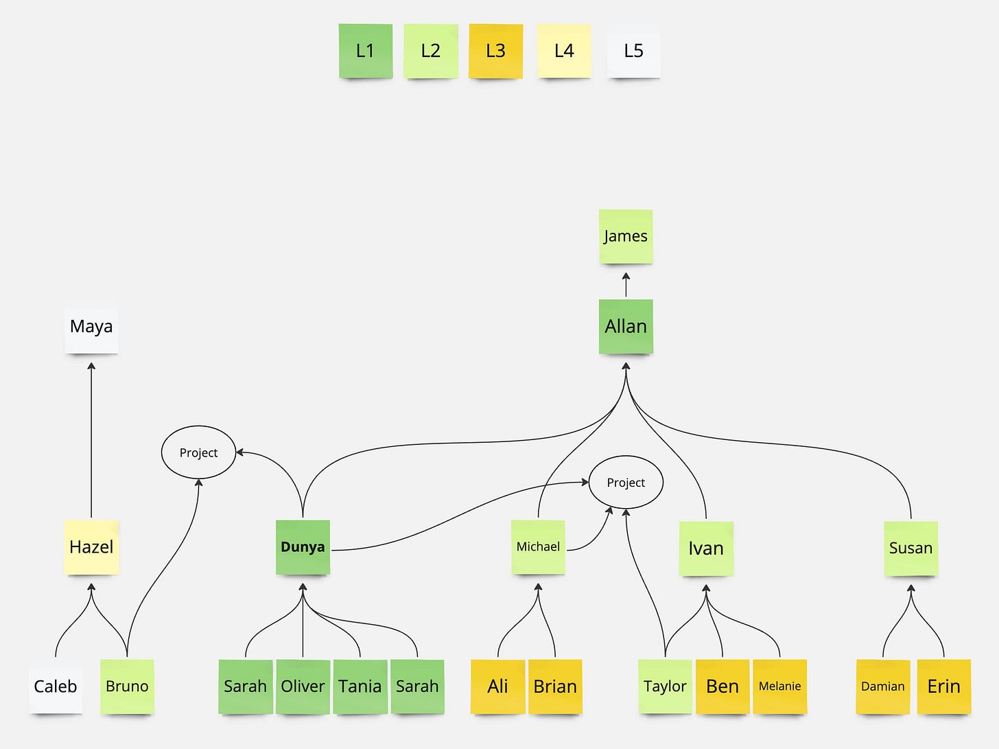
In this tree, Dunya is in the center. She has 4 direct reports and her peer (Michael) has two direct reports. Both Dunya and Michael report to Allan whom himself manages 3 other engineering managers. Those managers manage many other Individual Contributors (IC).
We use a color code to express the degree at which you can exercise influence. Those people to whom you have a single line to are L1. Those people are the ones you can influence the most. Afterall it is easier to talk to your peers for help or your team members than it is to ask the CEO of the company.
Those people who are two lines away from you are L2. It is also possible to influence them however it would require more effort to do so. In the above example, Dunya would be able to influence Ivan however that would require more work since there is no way for her to enforce what she would like to see differently. She would have to convince Ivan (using persuasion, data, or similar) to be able to influence him do what she would like.
Similarly, those who are three lines away are a L3. L3 is still influenceable however it would require significantly more work than it would take to convince L2. In my humble opinion it is not worth spending a lot of effort on these levels as the return on investment would be lowered significantly.
So far, what we have seen is no different than an organizational chart1. The only difference is the circle marked project. Quite often, people in companies interact with each other through projects instead of reporting lines. There will be many projects, migrations, crafts, workforces, etc. where people from different teams will be collaborating on. We represent such initiatives using the ellipse (in the above graph) where we connect different members through that bubble. This allows us to see what the sphere of influence of an individual is across teams. In the above example we can see that Bruno is a L2 to Dunya since they cooperate on the same project. So again, we’re just counting the number of lines connecting the two.
This way of thinking also helps us understand the effect someone has had on their peers. Think Performance, where someone who has managed to move metrics for their L1, L2 and L3 has apparently had a great impact on a larger sphere. Someone who has only managed to help their L3 might be focused on the wrong things (since they’re actually not helping their own team but rather helping others). And someone who has only affected their L1 might still be a mid level engineer and would have to increase their sphere of influence to have greater impact.
Observe
Now that we understand where we are positioned in the organization and how are interactions look like, it is time to collect data and try to understand the pain-points that could leverage your expertise.
Collect
Whenever I join a new company or when I switch teams, I always start by doing 1:1s with everyone in the team (not only engineers) where I ask them a single question:
What are the things that annoy you the most or that slow you down?
This question allows me to understand the biggest challenges that the team is facing, which for sure is important for me to address as an Engineering Manager. Doing so will help me resolve those issues so that I can multiply my team's output.
Once I’ve collected all the issues I put them in a database2. There will be many issues which you’ll be hearing again and again from different engineers and that’s OK. Then we add three columns to this database called category, reporter and level. The category column helps us start grouping the issues under logical categories. An issue can fall under multiple categories. Once all issues have been categorized, we can sort the categories based on the number of times we’ve heard issues in that category. The Level column shows us from which level of sphere of influence we have heard this problem from. The reporter column helps us remember who gave us the issue.
This gives us a basic understanding of the frequency of issues, and the level which they come from.
Understand
The next step in Observe is to write down the categories and start doing a Root Cause Analysis3 (RCA) on each and every one of them. You can use any method to help do the RCA however I would strongly recommend to use something simple such as the 5 Whys. The idea with the 5 Whys is to ask “Why” 5 times (rather as many times as needed to find the root cause) to understand what the root cause of an issue might be. It would be better if you do this exercise with those people from your database. Luckily we kept this in our reporter column.
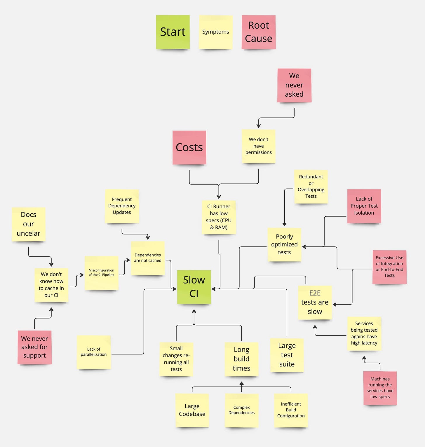
Having done this exercise you should obtain something that resembles this:
This map will allow us to see the root causes of some of the issues. Those would be the leaves of the tree which are marked red. It will also sometimes help uncover dependencies across different root causes.
Not only will this visualization help us understand the issues, their root causes but it will also help us understand the interactions between the issues. In the above example we can see that the “Excessive Use of Integration or End-to-End Tests” are affecting two different branches of the tree. Meaning that, removing this root cause will remedy quite some symptoms.
Prioritize
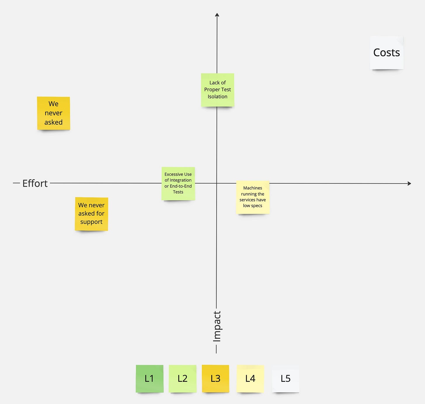
Now that we have understood our sphere of influence and that we’ve collected several root causes, we can get started with picking the problems to work on. In order to do so we will be plotting all of the root cause on the well known, Impact vs Effort4 matrix. Which would look like this:
This will help us understand what to prioritize. We also should not forget to use color coding we had in the See exercise, we would basically be enriching the matrix with a 3rd dimension.
Looking at the resulting matrix, one could conclude to start with the two leftmost tickets since they are very low effort, have some impact but also do affect a mid-level sphere of influence instead of starting with the rightmost one.
Act
At this point in time, we know what we can do to help our engineers. We also know how, solving those issue would impact the company. Lastly, we also get a clear understanding of who will be impacting by such an improvement.
Now that all pieces are in place, there is only one thing left to do: Act!


