Use diagrams to make engineering decisions visible
How simple visuals help managers explain systems, tradeoffs, and stories

We often tend to forget that humans are visual animals. Our brains have evolved to become good in visual pattern recognition. Hence the importance of leveraging visual tools in your storytelling.
It is so much easier to tell a story with visuals than to have a wall of text. As the saying goes: A picture is worth a thousand words1
Have a look at the following:
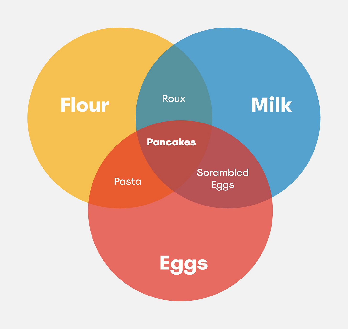
There are various dishes one can create just by combining flour, eggs and milk. When you only combine flour and eggs then you obtain pasta. When you combine flour and milk then you obtain batter. When yon combine milk and eggs then yon get an omelet. But if you combine all three of these ingredients then you obtain pancakes.
This block of text is explaining the relationships between the three ingredients in 59 words.
Instead, let's have a look at a visual representation of the exact same information.
Here, we have the exact same information. However it is now significantly easier for us to understand what's going on. Not because there was anything wrong with the description. Rather because we are hardwired to be able to more easily decode visual information.
For most humans, it is difficult to think of any problem in abstract terms, which makes is it essential for any engineering manager who's trying to have a bigger impact, to learn to leverage the power of visual storytelling.
Can you remember the number of times where you were in a brainstorming session with several other engineers where an engineer is explaining the architecture they have in mind and the whole group keeps nodding along. A couple of weeks later, you start picking up the stories but you realize that the team has a lot of questions around how to implement the desired architecture. This is a common anti-pattern. When complex topics are being discussed verbally, we will tend to skim over the details and focus on the fluidity of the conversation at hand. If only we would have drawn what we had in mind, we see a more in depth conversation happening where we address the details.
Information Graphics
Data is not easy. Not only are there various types of data (nominal, ordinal, discrete, and continuous)2 but there are endless ways in which data can be visualized3. Furthermore, even if you well understood the intricacies of data, telling a story with it is even more difficult. Which makes “visual storytelling” an extremely difficult topic.
Since we are not trained to be professional data visualization specialists4 it might feel daunting at first to start leveraging visuals. We would recommend you start with something like Julie Steele and Noah Iliinsky’s “Beautiful Visualization” or Nathan Yau’s “Visualize This” both of which contain everything you need to know to get started with visual storytelling.
At it’s heart, it’s all about brevity. In the pancake example, one could argue that depending on the cooking method, many more dishes could be generated by using the three ingredients and therefore the graphic is incorrect. However, it’s not about correctness. It’s about me being able to convey the core message which in this case is about the fact that various dishes can be created.
Keep asking yourself: What message I’m I trying to convey with this visualization
Tooling
When it comes to tooling, as with everything else, it should not stand in the way. You should be able to whip open your favourite diagramming tool and quickly sketch something. This will allow you the people you’re brainstorming with, to focus on the content instead of having to struggle with the visualization. There are many tools out there. You could opt to keep things simple and start with a basic spreadsheet application but you can also go and dive into an advanced visualization such as Tableau. Independent of what you use to visualize, don’t forget the fact that it’s the story that matters.
SaaS
Luckily, there are many tools out there which help providing basic building blocks so we can get started easily. Here is a shortlist of a couple of tools which you can make use of:
All of these are viable options, where they provide you a nice and easy way of being able to create almost any type of visual in the comfort of your web browser. They all try to address to problem from a slightly different angle where Miro tends to take the approach of trying to replicate a whiteboard, whilst Lucidchart is trying to be the swiss army knife5 of diagramming.
Independent of whichever you pick (or the company you’re in enforces you to use), do try to become fluent at it. You don’t want to waste 5 minutes of your time, in the middle of a fluid brainstorming session, to learn how to color the background of a shape using a hex code. Such things should more or less be second nature so you can use your tools effectively.
Diagram as Code
This is a more declarative6 way of visualizing things. Such Diagram as Code7 tooling allows one to define the desired visualization in code which then gets rendered by the engine.
Here is a shortlist of a couple of tools which you can make use of:
For instance, we could define the following diagram in mermaid.js:
stateDiagram-v2
    [*] --> Still
    Still --> [*]
    Still --> Moving
    Moving --> Still
    Moving --> Crash
    Crash --> [*]
Which well then get rendered like this:
Such a methodology has many advantages. To start with, now you can start versioning your diagrams allowing you to branch, review, and have any other version control super power you wish to use. This works especially well with software engineers as they are already quite familiar with this way of working. Furthermore, such a diagram can be easily generated by a script. Say, you’d like to see the dependency diagram of all the services in your company, all you’d need to do is to get the list of services and their dependencies and generate a diagram as code style file and render it.
The main downside of such a method is that you loose a bit of control on how things get rendered. You might not have a way to influence the colors, positions, and fonts being used whilst rendering in which case the SaaS tools mentioned above will provide you with more freedom.
Overall, we believe that the Diagram as Code methodology is, in our opinion, an under utilized approach to help enrich visual storytelling in tech companies.
Pitfalls
Scale
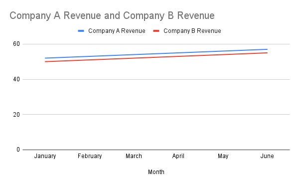
Let's have a look at the following graph:
We can see a large difference in revenue between the two companies where Company A seems to be doing significantly better.
Now let's add the scale into it:
Now we see a different story. Now that we’re able to see the proper scale, we can see that the difference in revenue between the two companies are actually not that significant.
It is important to understand that with the way you present data, you can bias your audience in either direction. Just, don’t be evil8.
Bias
Since we humans are so well at pattern recognition, we do it fairly unconsciously. This means that a lot of the meaning we associate to what we see is based on all our previous learnings and biasses.
There is a significant tendency for our brains to associate negative feelings with the color red. Similarly whether or not we highlight a word the type of font we use (imagine using comic sans in your quarterly revenue graph) or even the icons we pick, can and will impact our perception of the data being presented.
Conclusion
Using visuals to tell a story is in important skill to have in your tool belt. In this article we have covered some tools to help you easily visualize information to help reason about complex topics.
Better to have a diagram which you realize will not be useful and throw away, than to have no diagram but to realize later that your team has built the wrong thing.
For your next RFC9 or your next ADR10 whether you’re trying to convince or collaborate, think of how you can visualize the information at hand to help increase the shared understanding of your peers.


Questo articolo mi ha fatto riflettere su quanto spesso mi affido solo alle parole nelle riunioni. L'esempio dei pancake è stato illuminante! È vero, un disegno risolve discussioni in cinque minuti che con le parole durano mezz'ora. Dovrei assolutamente migliorare le mie capacità di diagrammazione. Forse potrei iniziare con un <a href="https://mermaidviewer.com/">mermaid flowchart tutorial</a> per integrare meglio le visualizzazioni direttamente nella documentazione Markdown. Un post molto utile e pratico!